The world of design is a colorful one. With so many shades and hues to choose from, it is easy to overthink the color palette. As creatives, usually, we are best at overthinking. That’s where color palette generators come in. They act as a guide to help you make your choice when selecting a set of colors. You can explore millions of color combinations with one click and find the best palette for your project for free.
What is a color palette?
A color palette is a set of colors used together and can be seen almost everywhere where combining colors is involved. Although the creator doesn’t go through the process of palette creation in most cases, it is easy to notice it. Just open your wardrobe, and you’ll see your personal color palette.
In design, we use color palettes to keep our work consistent and convey the right messages, feelings, and emotions. It helps to know what colors will work best in a specific project and what colors should not be used. That’s why creating a sound palette, in the beginning, is so important.
In this post, we will focus on the tools you can use to make the process easier and more enjoyable, but feel free to check “The secret meaning of logo colors,” where you can expand your knowledge of colors and psychology. So let’s begin!
Material.io
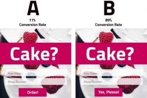
You know this resource well if you have designed a mobile application for Android or anything else using material design. It’s a tool that allows you to select the primary and secondary colors you want to use in your application. The tool automatically creates the best color matches according to material design. Easy, simple, fast, effective.
You can also use colors that are not already in the kit. Finally, it shows you the palette in mobile application design and notes which combinations would not work.


Adobe Color
One of my favorite tools related to color is Adobe Color.
Starting with the general color wheel and picking a base color, you can apply harmony rules to help you find the best fits for your project faster.

An excellent feature is extracting themes and gradients from existing images or screenshots.

My favorite part of Adobe Color is the accessibility checker. Approximately 8% of people in the world have color blindness. Creating inclusive design is becoming increasingly important, so always check the template you are making for accessibility. The checker marks the conflicts and gives recommendations.

If you use Adobe Color, you want to have an Adobe profile. The registration is free, and here is what you can do with it:
- Create your own library
- Save your palettes
- Share palettes in multiple formats
- Re-use color palettes from the “Explore” and “Trend” sections
- Share your color palettes with other designers and get them inspired by your great creativity.
In addition to the free version, Creative Cloud users can use the library through all Adobe apps.

“Explore,” and “Trends” are two very similar sections in Adobe Color – both are compilations of ready color palettes. You can use them as inspiration or re-use the palettes directly by adding them to your library. Both collections have a “search” by color, mood, or words, and the results are shockingly specific. The apparent difference is that in Trends, you see the most popular colors grouped by categories, or industry, which I find helpful.

ColourCode
Last but not least, the app we were tipped we should check out is ColourCo.de, and I think it’s an excellent free tool to share with you.
It is a very straightforward application; you open it and know what to do.
The first option for creating a color palette is “Freebuild“: The color changes by moving your mouse on the screen. Colors can be:
- Selected (with a click)
- Added (“+” on the right side of the screen)
- Removed (“-” on the left side of the screen)
- Edited (when you click on top of the color after it is already selected)
A crucial part of the process is – if you like a color or a color palette, you need to click to keep it.

Below the “Freebuild” in the menu are color harmony rules you can use to create your palette. Once the rule is selected, you can hover with your mouse over the palette, and the colors will change, creating unlimited perfect color combinations within seconds. And once more, click when you like a palette to keep it!

You can edit every single color if you use “Freebuild.” However, if you are using color harmony rules, you can only change the base color, which will change all other colors in the palette accordingly.
Sharing: ColorCo.de has several ways to share your work, including a link.

It’s an excellent small tool to use. I love how straightforward it is, and although the app creates the palettes when using harmony rules, you still have control over it. We do not need to overcomplicate our lives, so give it a try!
A little feedback for TopTal: Maybe add a tooltip or a message saying that “to select a color, you just click“? 🙂 I think this would increase the usability. 🙂
BONUS: Colorblind Web Page Filter
After seeing Colourco.de, I spent time researching the free tools TopTal offers, and I loved the next one even more.
Ever wondered how a color-blind person sees your website? Here is how:

There are has four different filters:
- Protanopia – red/green color blindness; anomalous red cones;
- Deutanopia – red/green color blindness; anomalous green cones;
- Tritanopia – blue/yellow color blindness; anomalous blue cones
- Greyscale/achromatopsia – quick check for all forms of color blindness.
As designers, we often find ourselves in a situation where we must choose a color palette for our projects. I hope my thoughts will help you find your next favorite tool to work with and fill your everyday life with passion.
Happy creating!