Forma 50 Is Coming This March
This March, we are launching the first product from our newest collection: Forma 50.
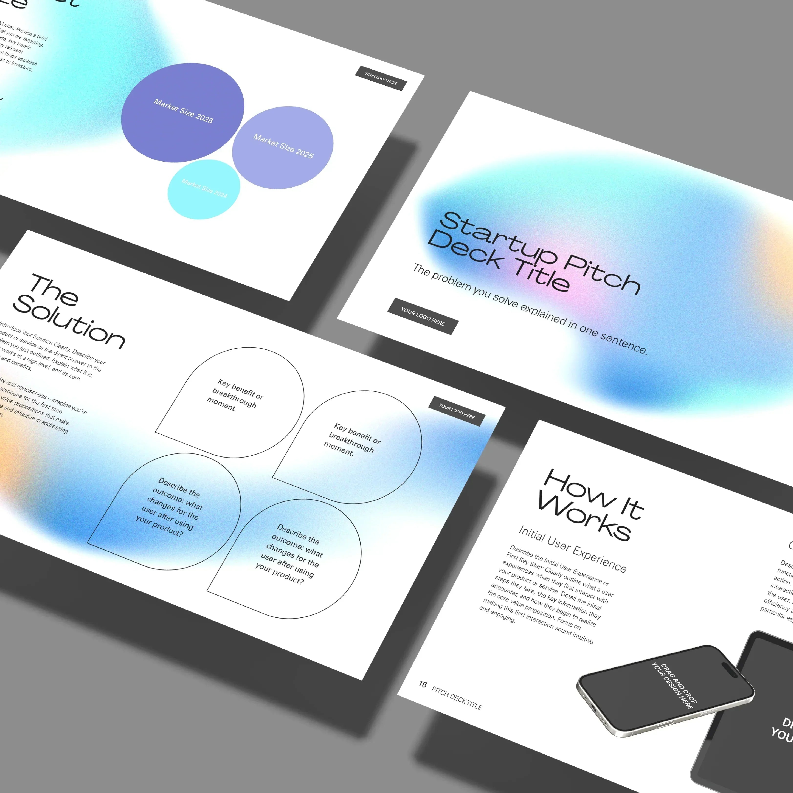
The pilot release is a Pitch Deck, and it introduces a design direction that feels both controlled and luminous. Inspired by the Northern Lights, Forma 50 combines soft holographic gradients with strict, well-defined layouts. The balance between atmosphere and precision is intentional. Light moves in the background. Structure leads in the foreground.
This is a deck built on layout discipline.
Structure First. Always.
Forma 50 is designed around clarity. The grid is strong and consistent. Margins are generous. Headlines are confident and purposeful. In several slides, typography stands alone without visual distraction. Pure text, carefully spaced, becomes the main visual element.
That choice is deliberate.
When a slide contains only a strong headline and a short statement, the message lands with more authority. When numbers, market insights, or strategic points are presented inside a clean framework, they are easier to process. The layout does not compete with the content. It supports it.
For founders, consultants, marketing teams, agencies, educators, product managers, and corporate teams, this matters. A presentation often carries complex ideas. The way those ideas are structured visually can either create confidence or create friction.
Forma 50 removes friction.

Contrast That Creates Rhythm
What makes this collection stand out is the contrast between minimal typographic slides and visual-driven slides.
After a bold, typographic statement, the deck transitions into product mockups and visuals placed with precision. Devices, screens, images, and product photography are framed within the same structured system. The gradients softly illuminate the background, creating depth without overwhelming the layout.
This rhythm keeps attention alive.
It allows storytelling to move from clarity to demonstration. From idea to proof. From concept to application.

Who Can Use Forma 50
Forma 50 was not built for one specific industry.
It works for:
* Startups preparing investor presentations
* Established companies introducing new products
* Agencies presenting proposals
* Consultants explaining strategic frameworks
* Creative professionals showcasing portfolios
* Marketing teams presenting campaigns
* Educators structuring workshops or masterclasses
* Corporate teams aligning internal strategy
If your business needs to communicate ideas clearly and professionally, this collection supports that goal.
The aesthetic feels modern and forward-thinking, yet neutral enough to adapt to different sectors. It carries innovation without being limited to tech. It feels premium without being exclusive to luxury. It feels minimal without being empty.

Why Use Forma 50
Because structure builds trust.
When your slides follow a consistent visual logic, your audience senses control. Clean alignment, predictable spacing, and disciplined typography signal professionalism. You appear prepared. You appear strategic.
At the same time, the aurora-inspired gradients bring emotion and depth. They add atmosphere without clutter. They give your presentation personality while keeping the message sharp.
This balance makes Forma 50 strong for high-stakes situations: funding rounds, partnership discussions, board meetings, sales presentations, or keynote talks.

The Beginning of a System
The Pitch Deck is only the first step.
Forma 50 will expand into a full design system. Matching templates across categories will follow, allowing brands to maintain visual consistency across decks, one-pagers, social media, case studies, and more.
Consistency builds recognition.
Recognition builds credibility.
With Forma 50, your communication gains structure, light, and clarity from the very first slide.
The first drop is coming this March.


Let customers speak for us
from 12 reviewsGood quality.
I recommend.
The sales deck was beautifully structured and incredibly easy to make our own. Every section comes with clear guidance on what to include, so we never had to guess how to shape the story or present the offer.
It made the whole process feel considered, fast, and polished. Very happy with the order.
This eBook template gave our ideas and services a much more polished, credible presence. The layouts are clear, easy to adapt, and make the final document feel like it comes from a well-established company.
The three cover options were a great addition, giving us flexibility to match the right tone for each topic.
One of the most useful templates I’ve bought. I’ve already created 4 short eBooks with it, and I’m planning to reuse it for the next one as well.
Great design and easy to work with! The instructions are really helpful.
I honestly bought the media press kit because it came in a bundle, without any real plan for it. Then we got invited for an interview and I was so glad we had it. It took very little time to update, export as a PDF, and send over something that looked professional and organized. I didn’t expect this template to become so useful, but now I’m really happy we have it.
I used this template to prepare a workbook for a short webinar, and it was such a nice surprise. It helped me create something polished and professional without spending days trying to design it myself. And honestly, even if I had spent the extra time, I don’t think I would have made it look better.
Fresh and modern template. What I like most is that the template has 3 covers we can pick from and not only that, but we are planning to create unlimited lead magnets based on this single template. Useful 100%. I recommend!
I used this for a client proposal and it was really easy to work with. We added our company details, adjusted the Canva file, and now we have a solid proposal template we can reuse for future clients. Saved us time and looked sharp.
Love this one!
Great deck, I just got it and I am very happy with the way the information is organized. I bought it together with some other templates from the same collection and I am happy I don't have to think about any design in the next months. All is done and easy to edit.
Share:
The Minimum Viable Brand Kit: What You Actually Need to Start Strong
Beyond Copy-Paste: Customizing Templates With Intention